3. Introduction to CSS
Learning Objectives
By the end of the session you should:
- be able to add style sheets to your web pages
- be familiar with basic styling selectors, units, colours and properties
- be able to style the HTML elements on a web page
- be able to style groups of elements identified by class
- be able to style individual elements identified by ID
- be able to use a web page template
Topics
- How style sheets work
Style sheets allow you to customise the look of your web pages. For example you can change the font and font size, the paragraph margins and justification, the colour of the text or the background, and so on.
You can put a stylesheet directly into a single HTML file, but it is more normal to store your stylesheet in a separate file, so that it may be included in a group of pages sharing a common format.
One page can include multiple style sheets, with more-specific styles over-writing (or modifying) more-general styles. This allows you to have a hierarchy of styles, and is the origin of the term "cascading" in CSS.
Selectors
Stylesheets consist of a series of style definitions, with each definition comprising a Selector and a list of Properties. The selector identifies which elements on the web page are going to be styled, while the list of properties defines how the current styling for each of the selected elements is to be modified.
Here is a simple style definition that sets the font size for all the <h1> elements in a web page:
h1 {
   font-family: Arial, Helvetica, sans-serif;
   font-size: 14pt;
   font-weight: bold;
}
In this example "h1" is the selector, and "font-family", "font-size", and "font-weight" are the properties to be assigned.
A second type of selector refers to all HTML elements that share a common "class" attribute. Here is a simple style definition for text enclosed within any elements that have a class of "quote". For example <div class="quote"> ... <div>:
.quote {
  font-family: Georgia, Times, serif;
  font-size: 90%;
  margin: 6pt 1cm 6pt 1.5cm;
  padding: 2mm;
  background-color: Linen;
  text-align: justify;
}
This might cause the following text and markup:
<div class="quote">
"It was the best of times, it was the worst of times,
it was the age of wisdom, it was the age of foolishness,
it was the epoch of belief, it was the epoch of
incredulity, it was the season of Light,
it was the season of Darkness, it was
the spring of hope, it was the winter of despair,
we had everything before us, we had nothing before us,
we were all going direct to Heaven, we were all going
direct the other way."
Charles Dickens: A Tale Of Two Cities (1859)
</div>
to appear as:
"It was the best of times, it was the worst of times, it was the age of wisdom, it was the age of foolishness, it was the epoch of belief, it was the epoch of incredulity, it was the season of Light, it was the season of Darkness, it was the spring of hope, it was the winter of despair, we had everything before us, we had nothing before us, we were all going direct to Heaven, we were all going direct the other way." Charles Dickens: A Tale Of Two Cities (1859)A third type of selector is used to style one particular instance of an element. This is done by giving one element in the file a particular "id" attribute and referring to that item in the the style. If you wanted to style this particular piece of content:
<h1 id="maintitle">The Beginning</h1>
You might use a selector specified as:
#maintitle {
   color:green;
}
Then this would apply only to the single element with an id of "maintitle".
Styling logical sections of a document
Commonly the elements of the document we want to style may not be a single HTML element, so we need a general mechanism for identifying arbitrary sections of a document to apply a style. For example we might have a header, footer and sidebar within the document that need to be styled differently to the main content.
HTML provides two general purpose tags <span> and <div> that can be used to identify logical sections of the document. By adding styling information to these tags in our stylesheet we can change the style of any arbitrary section.
The <span> tag is used to specify a section of text within a paragraph. It allows you to apply some arbitrary styling to the specified words. The <span> tag does not change the layout of the paragraph itself.
The <div> tag is used to specify a block of content made up of a number of other elements. The <div> tag will typically assume that the block section will be set off from surrounding material on all sides. Imagine it as a rectangular region on the page, like a header or a footer.
Here is a simple example of the tags:
<p>This sentence is <span class="green">rather green</span> in places.
<div class="quote">
  <h1>Quotation</h1>
  <p>Fashion changes, but style endures. Coco Chanel</p>
</div>
For which the styling might be:
.green { color:green; }
.quote { margin:2mm; padding:2mm; border:2px solid red; }
Linking to stylesheets
If you store your stylesheet in a file "mystyle.css" then it can be included into the header of the HTML document using a <link> statement such as:
<link rel="stylesheet" type="text/css" href="mystyle.css" />
Otherwise, you can include your style definitions directly in your HTML file between <style> ... </style> tags, usually in the header section of the file:
<html>
  <head>
    <style>
      h1 {
         font-size: 14pt;
      }
    </style>
  </head>
<body>
etc
Lastly, in rare instances you may need to put an ad hoc style definition on one specific HTML element. You can do this using the "style" attribute of the element, for example:
<h1 style="color:red">Something has gone wrong!</h1>
- CSS Selectors
The most important selectors are as follows:
Selector Example Example description .class .intro Selects all elements with class="intro" #id #firstname Selects the element with id="firstname" * * Selects all elements element p Selects all <p> elements element.class p.code Selects all <p> elements with class="code" element,element div, p Selects all <div> elements and all <p> elements element element div p Selects all <p> elements inside <div> elements The styling of selector can be restricted to circumstances when the object is in a particular state. So, for example, you can format an object differently when the mouse "hovers" over it. Here is an example for the <a> element:
/* unvisited link */
a:link { color: #FF0000; }
/* visited link */
a:visited { color: #00FF00; }
/* mouse over link */
a:hover { color: #FF00FF; }
/* selected link */
a:active { color: #0000FF; }
See link in Resources section for a complete list of selectors.
- CSS Units
When setting the size of some property in a style definition, there are a range of units that can be used.
Unit Description % percentage in inch cm centimeter mm millimeter em 1em is equal to the current font size. 2em means 2 times the size of the current font. E.g.if an element is displayed with a font of 12 pt, then '2em' is 24 pt. ex one ex is the x-height of a font (x-height is usually about half the font-size) pt point (1 pt is the same as 1/72 inch) pc pica (1 pc is the same as 12 points) px pixels (a dot on the computer screen) The 'em' is a very useful unit in CSS, since it adapts automatically to the font that the reader uses.
Percentages are measured according to some implied reference. For line height, the percentage is taken as fraction of the font height. For images, the percentage is taken as a fraction of the parent container size.
- CSS Colours
Colours may be specified by various means:
Name Format Example Description Hexadecimal #RRGGBB #ff0000
#00ff00
#0000ffred, green and blue intensity in base 16: 00-ff RGB rgb(r,g,b) rgb(255,0,0) red, green and blue intensities in decimal Colournames Name AliceBlue One of a set of 140 predefined colour names Here is a complete list of colour names.
- Common CSS Properties
Here are some common CSS properties:
Attribute Value Description color colour name or #RRGGBB text colour background-color colour name or #RRGGBB background colour text-align left | center | right | justify text alignment text-decoration none | underline | overline | line-through text underlining font-family typeface name, or list of names in preferred order typeface font-size height of characters font height font-style normal | italic font style font-weight normal | bold font weight font style, weight, size, family all font attributes margin top, right, bottom, left sizes paragraph margin padding top, right, bottom, left sizes paragraph padding line-height height line spacing border width, style, colour
styles = none | hidden | dotted | dashed | solid | double | groove | ridge | inset | outsetborder around element width horizontal size of item displayed width height vertical size of item displayed height position relative | absolute coordinate system top coordinate position of top bottom coordinate position of bottom left coordinate position of left right coordinate position of right For a complete list see link in Resources.
Here is a worked example of some of these:
<!DOCTYPE html> <html> <head> <title>CSS Demonstration</title> <meta charset="utf-8"> <style> h2 { font:bold 16pt arial, sans-serif; } p { margin-left:5mm; } .normal { font: 14pt times; } .distinct { padding:3mm; background-color:aquamarine; } #maintitle { font-size: 2em; color:blue; } .division { width:5cm; height:3cm; margin:0px auto; /* "auto" forces left and right margins equal */ background-color:ivory; border:5px solid brown; } .division h1 { text-align:center; } </style> </head> <body> <h1 id="maintitle">CSS Demonstration</h1> <h2>Styling a paragraph</h2> <p>This is a default paragraph</p> <p class="normal">This is a normal paragraph.</p> <p class="normal">This is another normal paragraph.</p> <p class="distinct">This is a distinctive paragraph</p> <h2>Styling a <div></h2> <div class="division"> <h1>Look here!</h1> </div> </body> </html>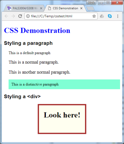
- Some advanced CSS topics
You may find these topics useful, but they are not essential.
Layout with <div>s
One popular method to make layouts that display well on both wide desktop screens and narrow phone screens is to divide the content between blocks which move around depending on the available screen size. For example, you might have blocks of material which can be displayed side-by-side or below one another:
A B or A B The trick to achieving this is to use <div> elements with a specified width and with the float property set to "left". If the combined width of the elements fits into the screen, then the blocks are displayed side-by-side, otherwise the blocks stack on top of one another. These blocks below change position depending on screen width (try it!).
.block {
   float:left;
   width:250px;
   height:100px;
}
...
<div class="block" style="background-color:#CCCCFF;">
100x250 pixels</div>
<div class="block" style="background-color:#FFCCCC;">
100x250 pixels</div>
100x250 pixels100x250 pixelsChanging layout for different media
Another useful facility provided by CSS3 is the ability to change styling depending on the nature of the client's device or the size of the device. This is performed using "media blocks" in your CSS file.
If, for example, you wanted one set of styles to be used when the page is displayed on a screen, but a different set of styles to be used when printing, you could set up media blocks like these in your CSS file:
@media screen {
   /* styles to use on the screen here */
}
@media print {
   /* styles to use on the printer here */
}
A common use of these styles is to change the margins and to remove any elements (such as headers, navigation menus or videos) which do not need to appear on the printed version. You can inhibit the display of any particular element by setting its display property to "none". For example:
@media screen {
  #header { display: block; }
}
@media print {
  #header { display: none; }
}
You can also use media blocks to identify different screen sizes, and choose different styles for narrow and wide screens. Here are some examples:
/* Tablet Portrait size to Desktop 960 */
@media only screen and (min-width: 768px)
                   and (max-width: 959px) {
   /* styles ... */
}
/* Mobile Landscape to Tablet Portrait */
@media only screen and (min-width: 480px)
                   and (max-width: 767px) {
   /* styles ... */
}
/* Mobile Portrait to Mobile Landscape */
@media only screen and (max-width: 479px) {
   /* styles ... */
}
Resources
- Lynda video tutorials at UCL. Search for "CSS". Particularly interesting are "Introduction to CSS" and "CSS Essential Training".
- Cascading Style Sheets Tutorial
- CSS Selector reference
- CSS Units reference
- CSS Colours reference
- CSS Properties reference
Exercises
Once you have completed these exercises, be sure to add the files to your exercises folder on the course web space.
- Create a web page ("ex3-1.html") that contains an embedded style sheet which changes the default styling of the <h1>, <h2> and <p> elements.
- Move your style sheet to its own file ("ex3-2.css") and link it to a new version of the web page ("ex3-2.html").
- Add to your style sheet a styling for elements of a given class. For example, you might add a border to elements with a class of "boxed". Demonstrate that your class style works for <p>, <span> and <div> elements.
- Add to your style sheet a styling for an element with a given ID. For example, you might make it have white text on a dark background. Demonstrate its use with suitable <div> content.
- Create a nicely formatted and styled table ("ex3-5.html") that gives the pronunciations of a few words in IPA transcription. Adjust the text colour, background colour, margins, padding and borders of the cells. Format the heading cells differently to the data cells. This page gives some advice on how to use Unicode to display the IPA characters: http://www.phon.ucl.ac.uk/home/wells/ipa-unicode.htm#insert
Homework
The goal of the homework is to build a web page using an existing "template". There are many of these freely available on the web, however they vary considerably in complexity. Some relatively simple templates can be found at perfect multi-column layouts. I have also created a simple 2-column layout that you can use. Right click on these links and select "Save link as ..." to get copies of my template files: simple2col.html and simple2col.css.
- Download your chosen web page template and copy the files into a new folder. Rename the files as you see fit.
- Remove all the content that comes with the layout and add your own. If you are stuck for some text, use the Lorem Ipsum Generator to create some meaningless pseudo-Latin prose.
- Now experiment with CSS. Give the page header, page footer and columns their own style in terms of colour, background and typeface. Modify the formatting of the headers, paragraphs and lists.
- Add some images and videos to make the page look more interesting.
- Check how your web page displays on different devices. You can use the Chrome development tools to set the display screen size: press F12 to open the tools window then click the "device mode" icon in the toolbar. What problems need fixing? Think about how you might address them.
- Upload your homework to your area on the course web space.
Word count: . Last modified: 08:58 20-Oct-2017.